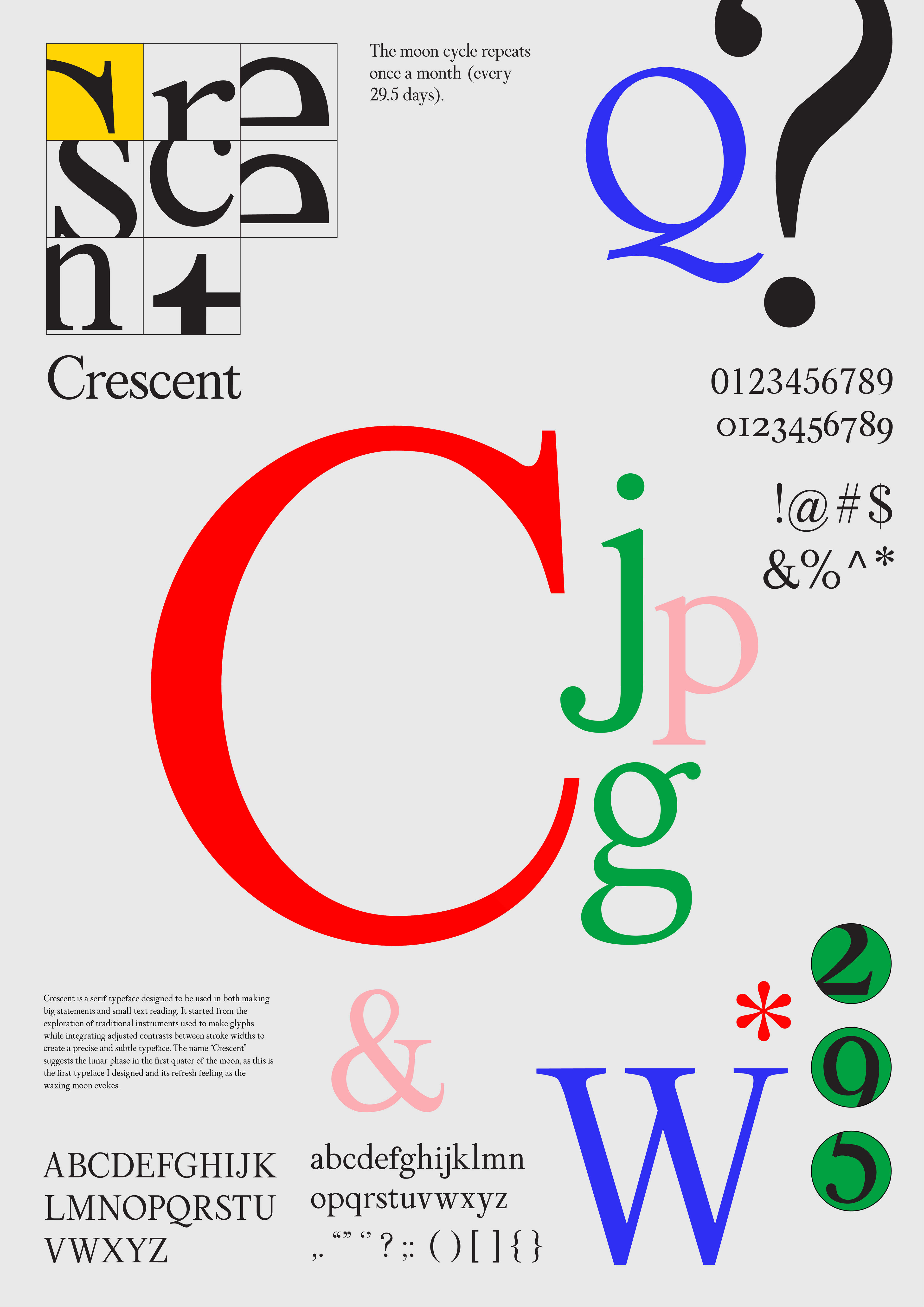
Crescent is a serif typeface designed to be used in both making big statements and small text reading. It started from the exploration of traditional instruments used to make glyphs while integrating adjusted contrasts between stroke widths to create a precise and subtle typeface.

Broadside

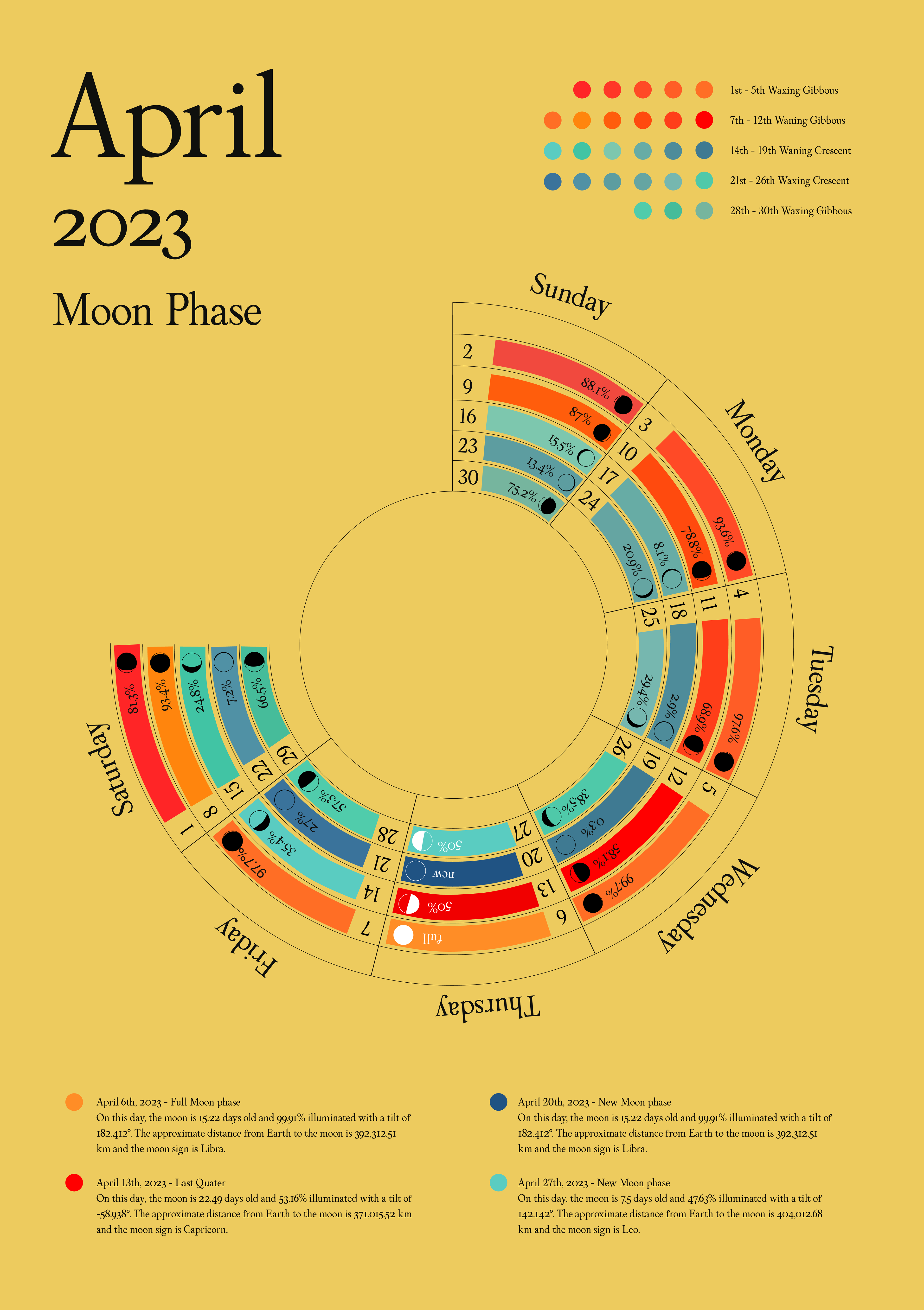
Typeface in use - Lunar Calendar April 2023
The typeface started by mimicking the letter forms of Baskerville, especially the characteristic of contrasting thin and thick stroke widths. However, the type became ineligible when the size decreased to reading text (thin strokes were way too thin), and proportion in letter forms seemed unbalanced.


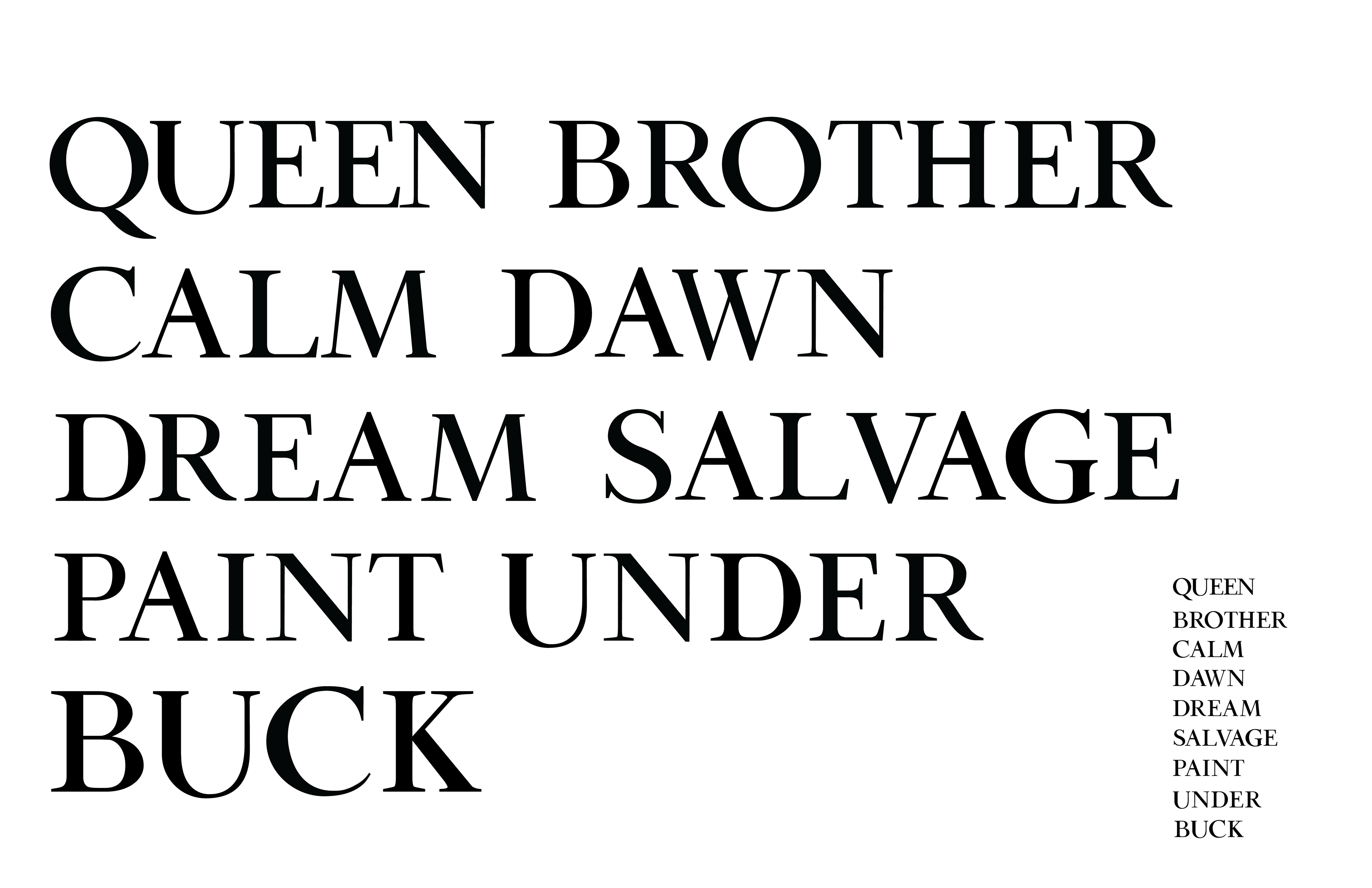
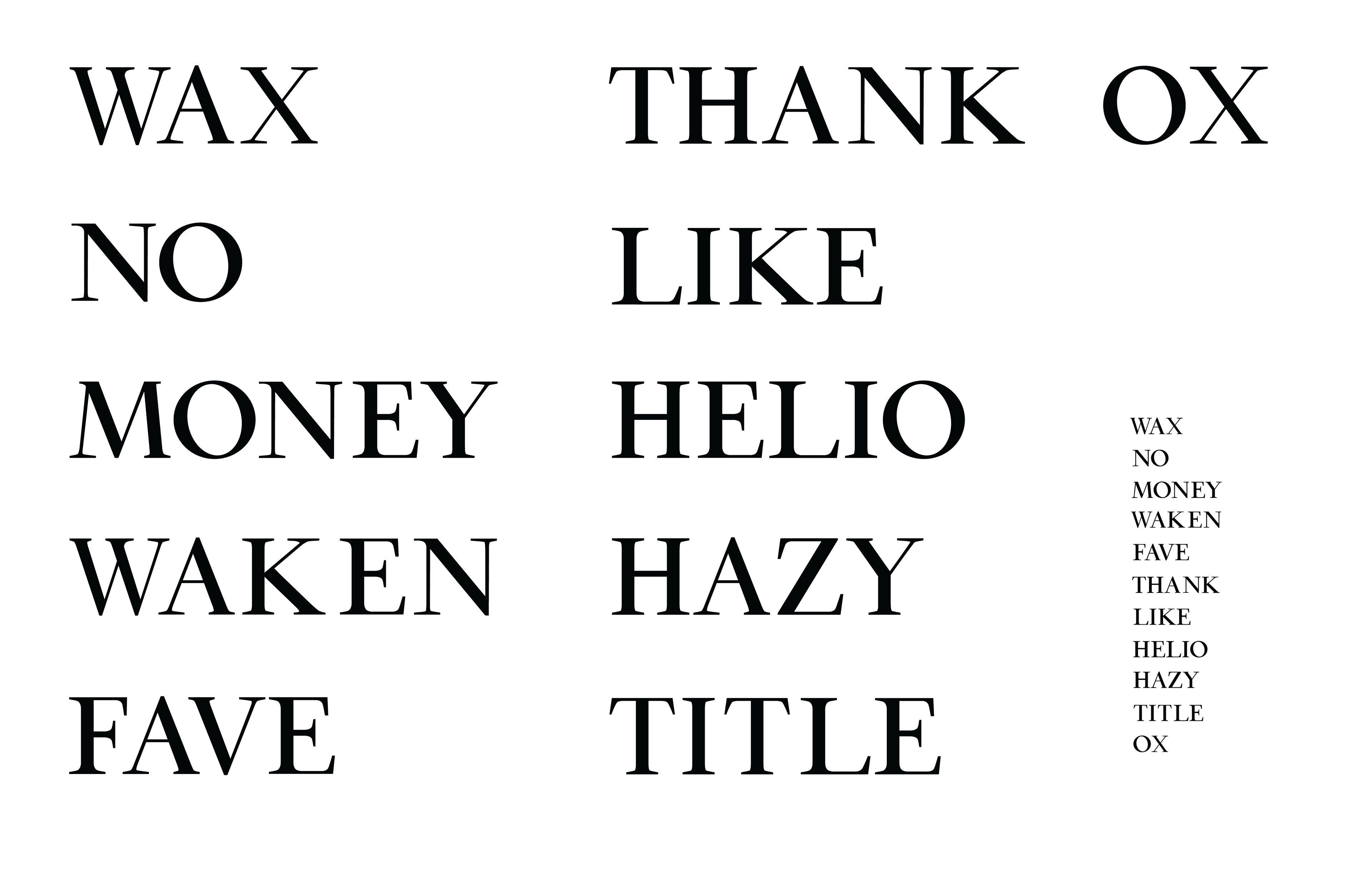
Gradually, I began adjusting the ratio of stroke width, and letter forms for both eligibility and aesthetics. Characteristic shown below:
Complete Typeface